

.svg)

Koulier
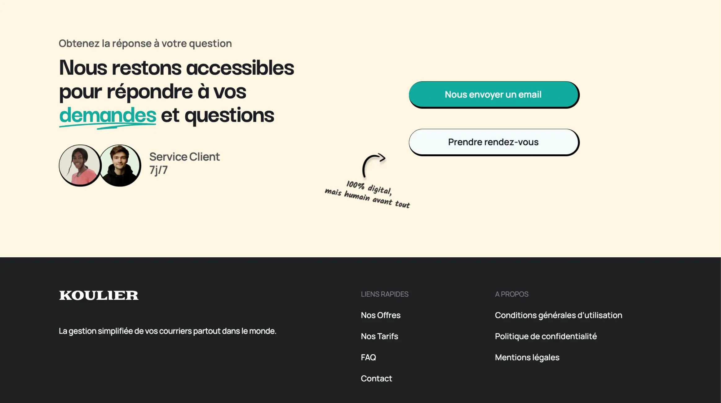
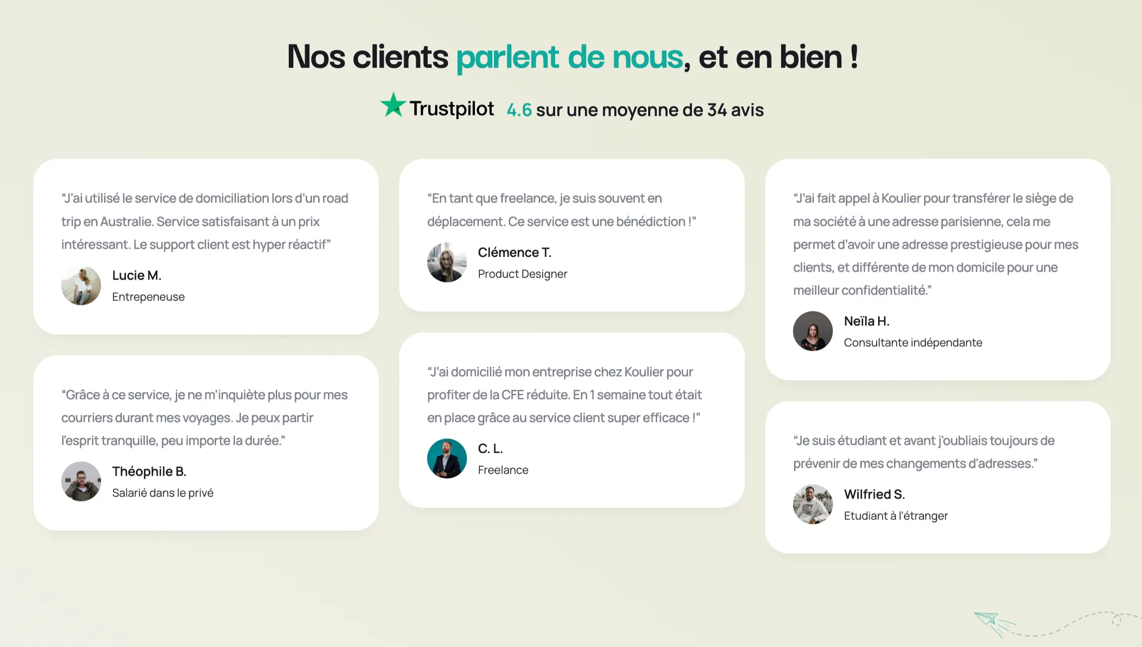
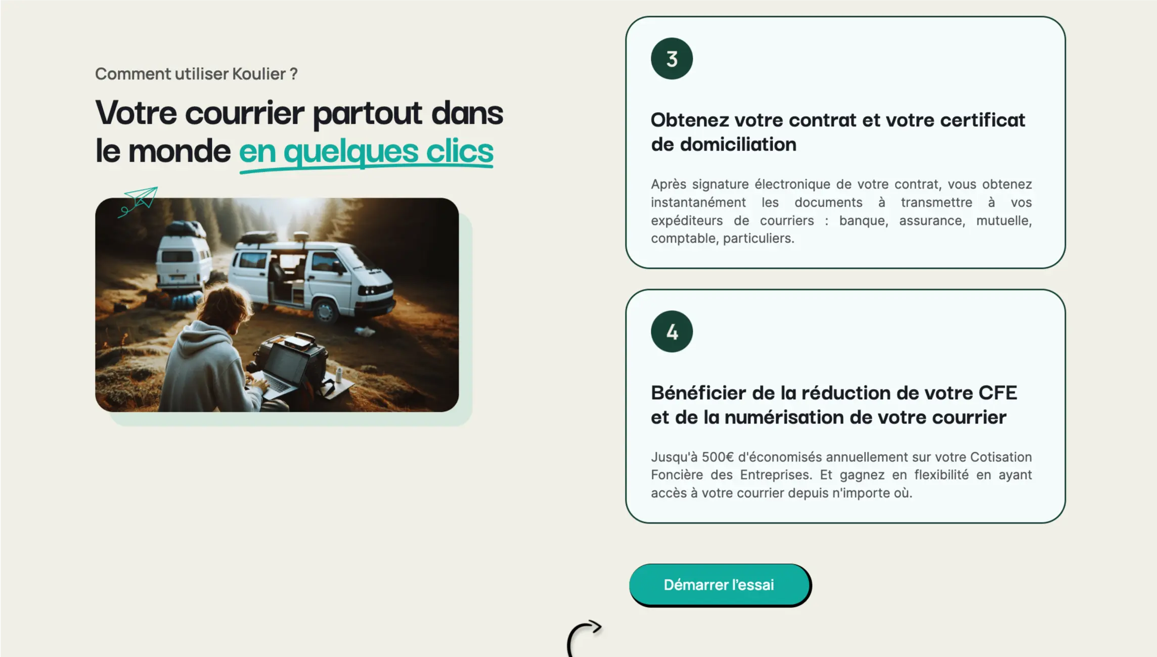
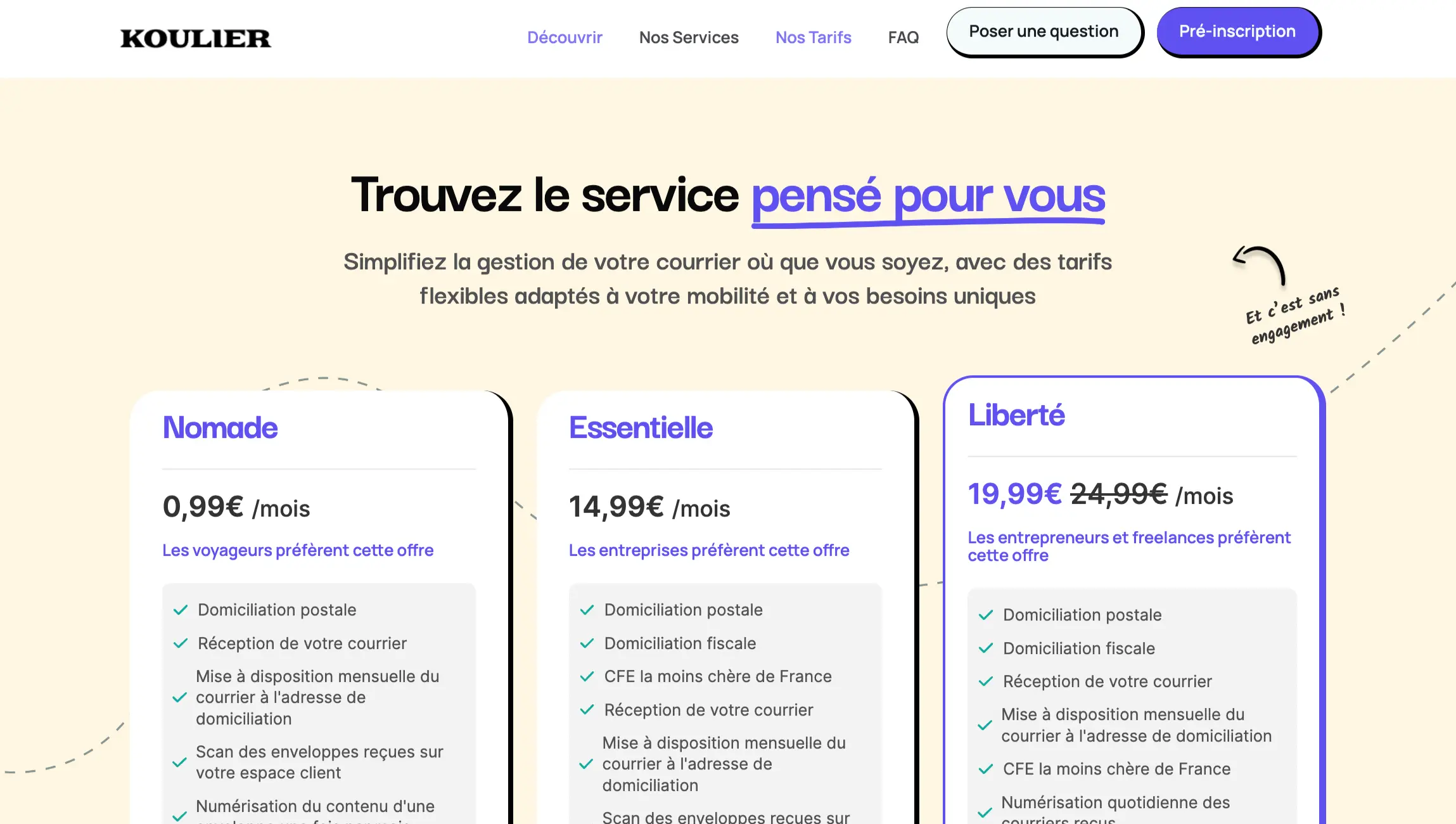
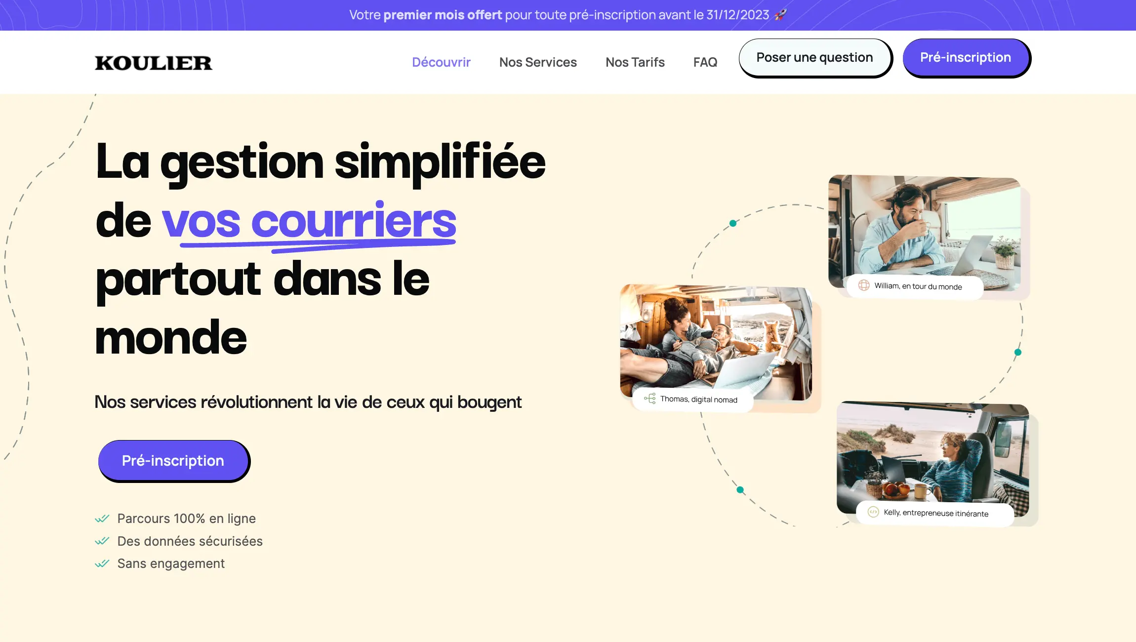
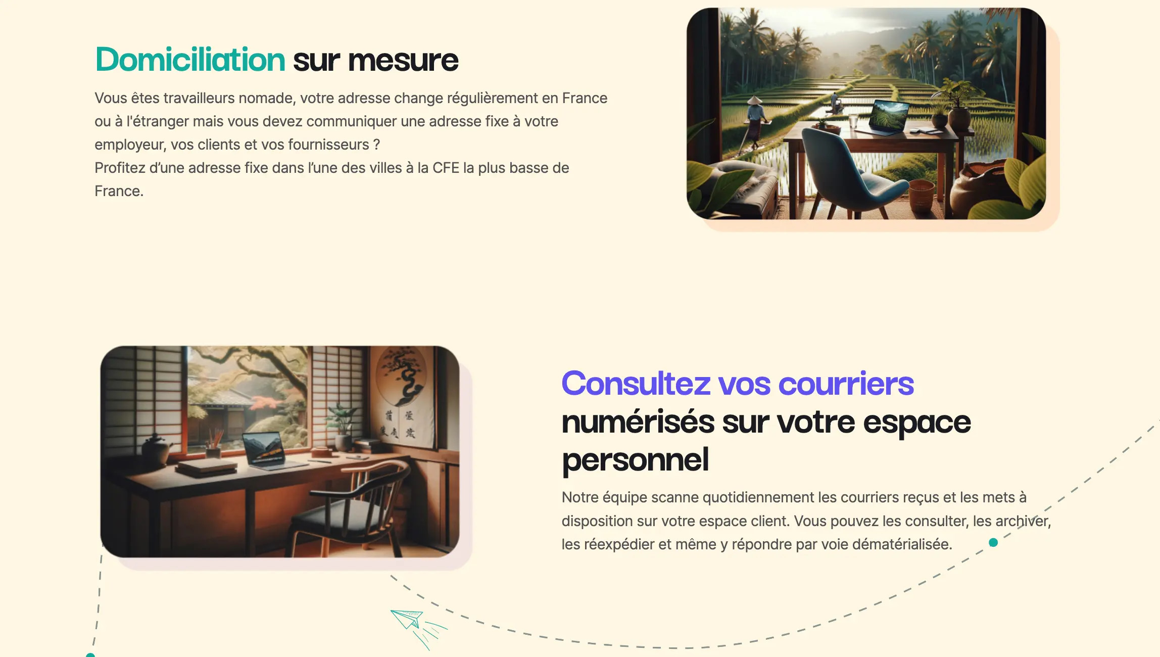
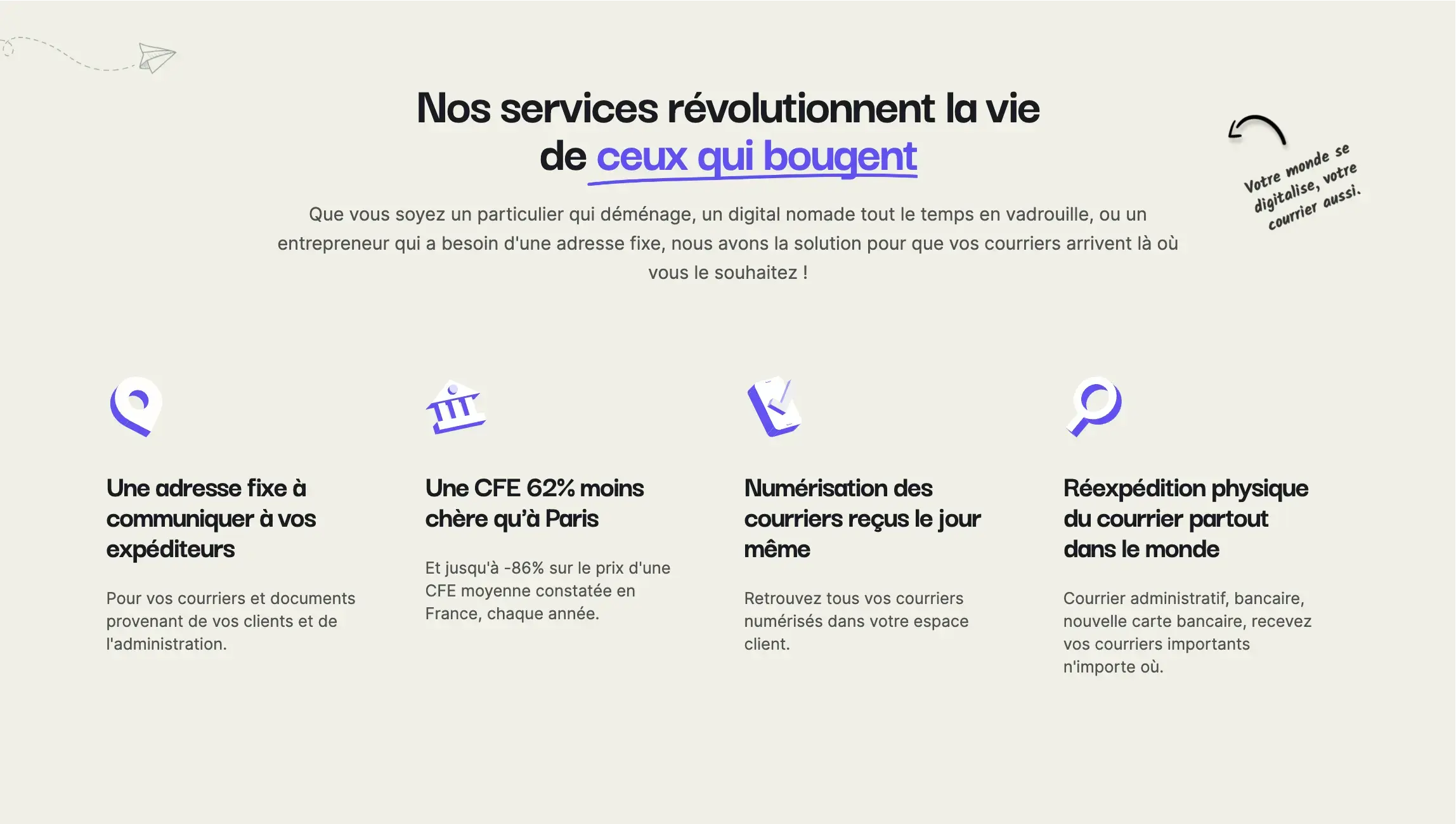
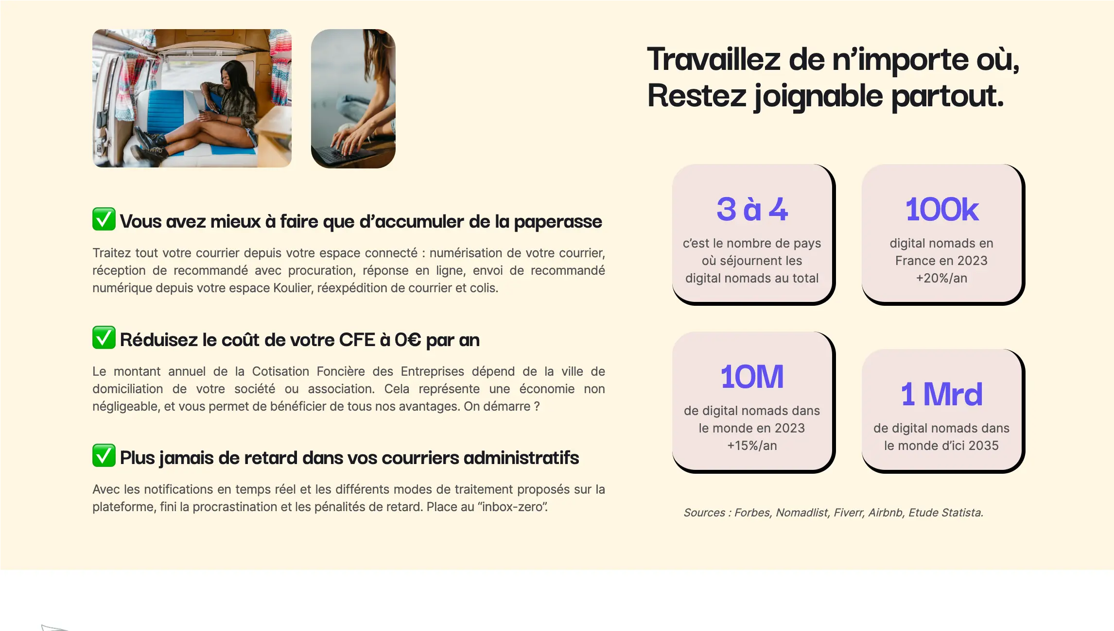
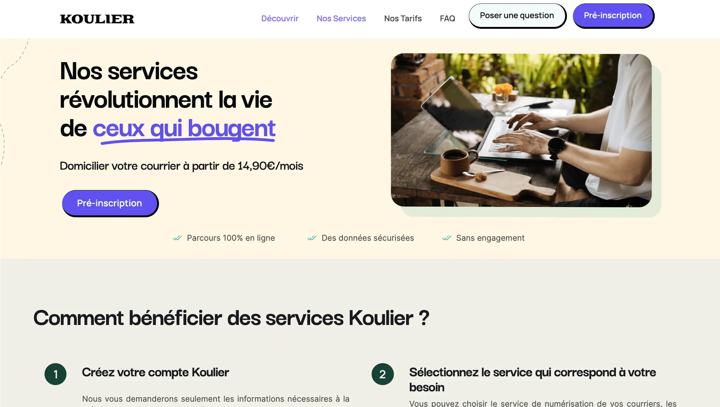



The client, a company offering a subscription-based postal and tax domiciliation service for digital nomads, faced several challenges. The main pain points included the complexity of the domiciliation process, the need to guarantee the confidentiality of mail, and the growing demand for a fluid, modern user experience.
Context
In an increasingly connected and mobile world, many professionals are opting for a nomadic lifestyle, working and travelling around the world. Managing mail and tax matters, however, can be a challenge for these digital nomads. This start-up set out to answer that problem by offering a flexible, practical mail domiciliation service meeting the needs of this new generation of workers.
Building the site took 8 weeks: branding and UX/UI design took 3 weeks and development of the site was carried out over 5 weeks.
Solution
1. Defining the competitive positioning: We carried out an in-depth market analysis to identify the gaps in existing services and the opportunities for differentiation. Our approach, centred on flexibility, confidentiality and simplicity, aimed to position the brand as the leader in mail domiciliation for digital nomads.
2. Voice and tone: We defined a friendly, professional and reassuring tone of voice to communicate with the users, whose profile is typically a young digital professional in their thirties. Our goal was to create a feeling of trust and familiarity while delivering a highly professional and reliable service.
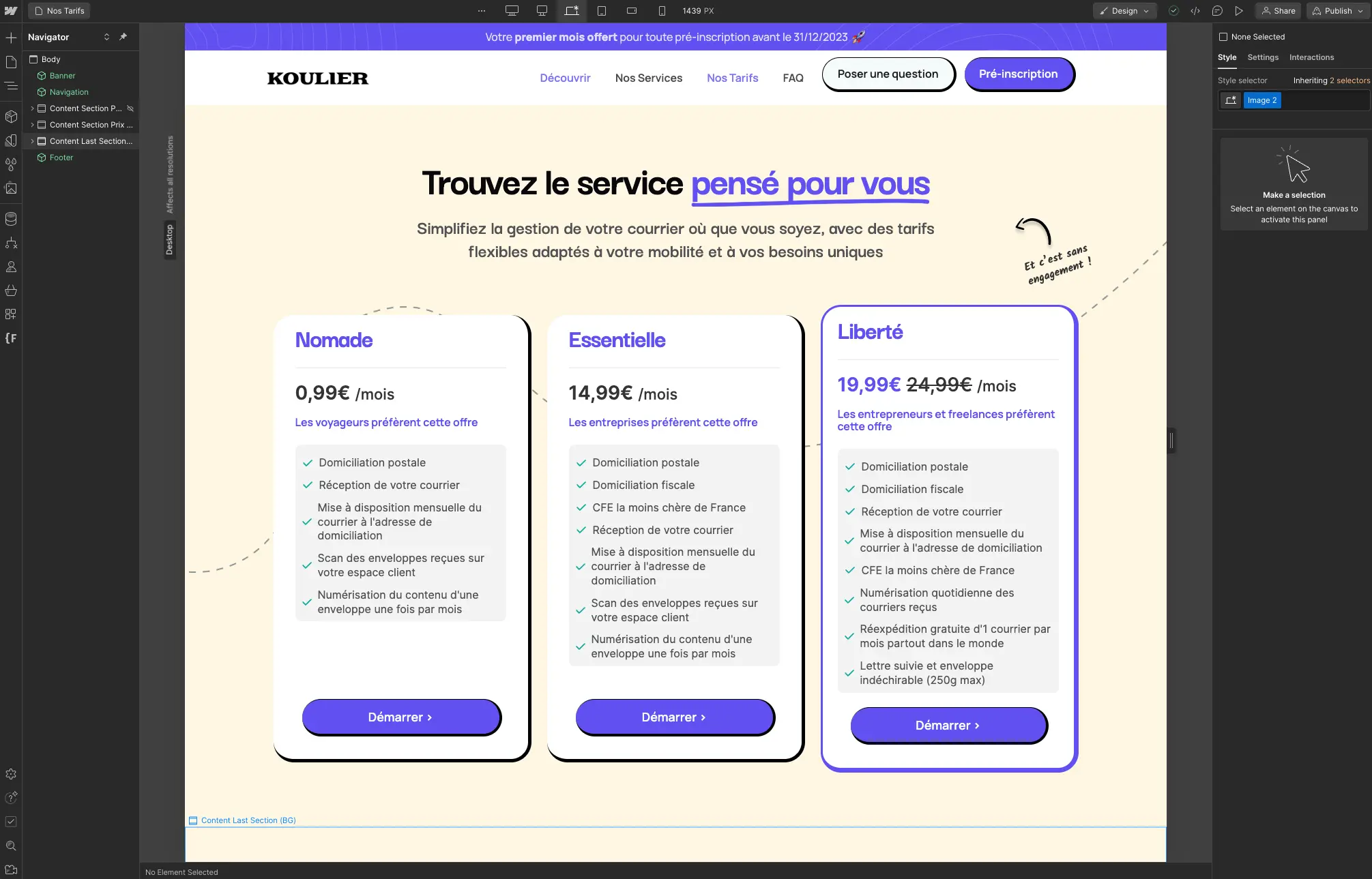
3. Points of differentiation: We highlighted the flexibility of the service, allowing users to manage their mail from anywhere in the world. Guaranteeing maximum confidentiality and security of the mail was a crucial differentiator. We also highlighted the simplicity and efficiency of the platform, offering a hassle-free user experience.
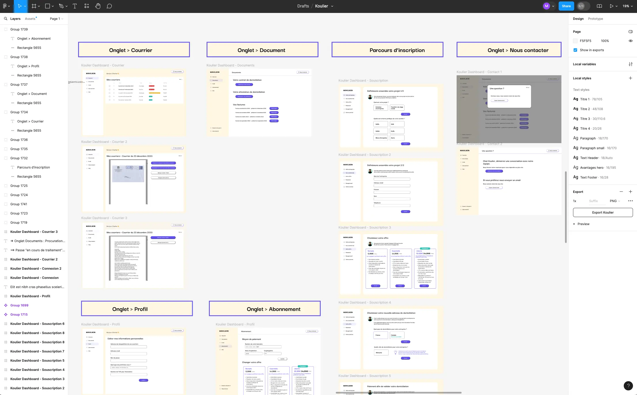
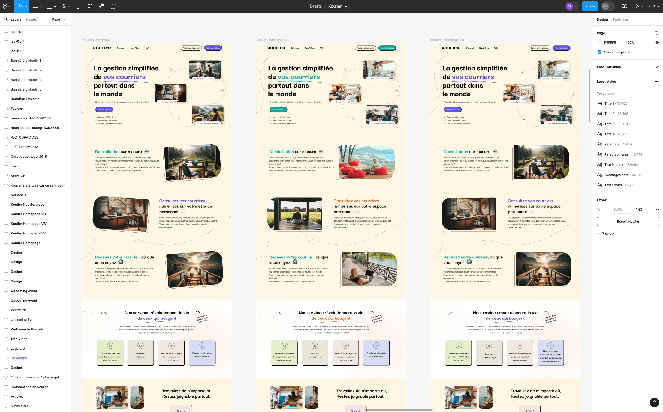
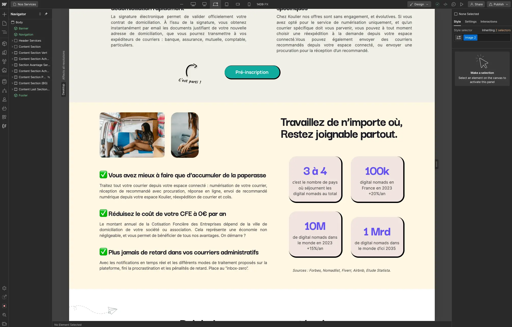
4. Graphic identity and style guide: We developed a modern, eye-catching visual identity reflecting mobility and connectivity. Bright colours and dynamic graphic elements were used to capture users' attention. The style guide was designed to be consistent with the brand identity, providing clear guidelines on the use of colours, fonts and visual elements.
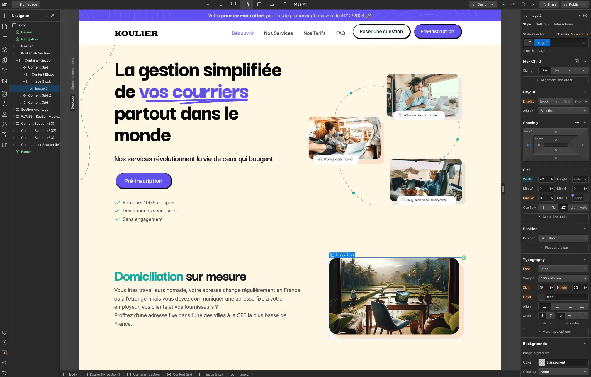
5. Site development: The website was built in Webflow with an intuitive, memorable interface, letting users sign up and manage their accounts easily. We integrated advanced security features to guarantee the confidentiality of user data and the security of the mail, along with SEO optimisation to maximise organic traffic potential. Mobile optimisation was a priority to meet our users' expectations, letting them access their account and manage their mail from any device.
Results
Thanks to a user-centred approach and a commitment to innovation, the delivered product met the client's expectations perfectly. User feedback has been extremely positive, highlighting the simplicity, reliability and convenience of the service. The brand image established anchors the brand for every visitor to the site and extends that brand identity across social media and communication channels. Since going live, the service records an average of 14 new subscribers per month, with a conversion rate of 7% on the offer pages.
Want the same results for your website?
Book a 30 minuts call to see what we can offer you.
Project Showcase
Have a project in mind?
TechFlow transforms ideas into results. Our clients see 40% faster launches and measurable growth within the first quarter.
Free · No commitment · 30 minutes


.svg)

.svg)