
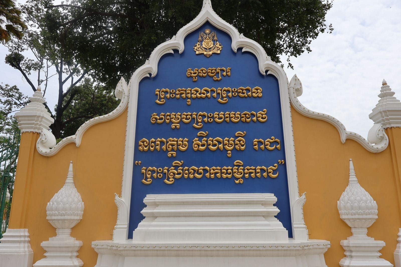
Most Cambodian business websites still load the wrong Khmer fonts, and it shows the moment a Khmer speaking visitor opens the site on a phone. Characters render as boxes, consonant stacks break, or the browser quietly falls back to whatever Khmer font happens to be installed on that device.
Choosing Khmer fonts for a website is less about picking a pretty typeface and more about confirming the font is genuine Khmer Unicode, ships as a real web font, and pairs cleanly with the site's Latin typeface. Below: what to pick, why the wrong choice costs readability and search visibility, and how to pair Khmer and English type without the page looking like two sites stitched together.
Why do Khmer characters break on so many Cambodian websites?
Khmer characters break on Cambodian websites mainly because the site is still running a legacy, non-Unicode font instead of a proper Khmer Unicode web font. Legacy fonts such as Limon and ABC Zero-Space belonged to a scattered set of more than 30 keystroke based encoding schemes, none of them the Khmer Unicode standard (Wikipedia, Khmer keyboard, 2026). Text typed under one of those schemes displays correctly only with the exact matching font installed.
A 40-room boutique hotel in Siem Reap running a decade-old WordPress theme is a common case: its Khmer restaurant menu was typed in Limon back in the mid-2010s, and the page still does not rank for any of the Khmer terms it contains. The characters on screen are not really the letters they display as, so a search engine, a screen reader, or a copy-paste into a chat all see the wrong text.
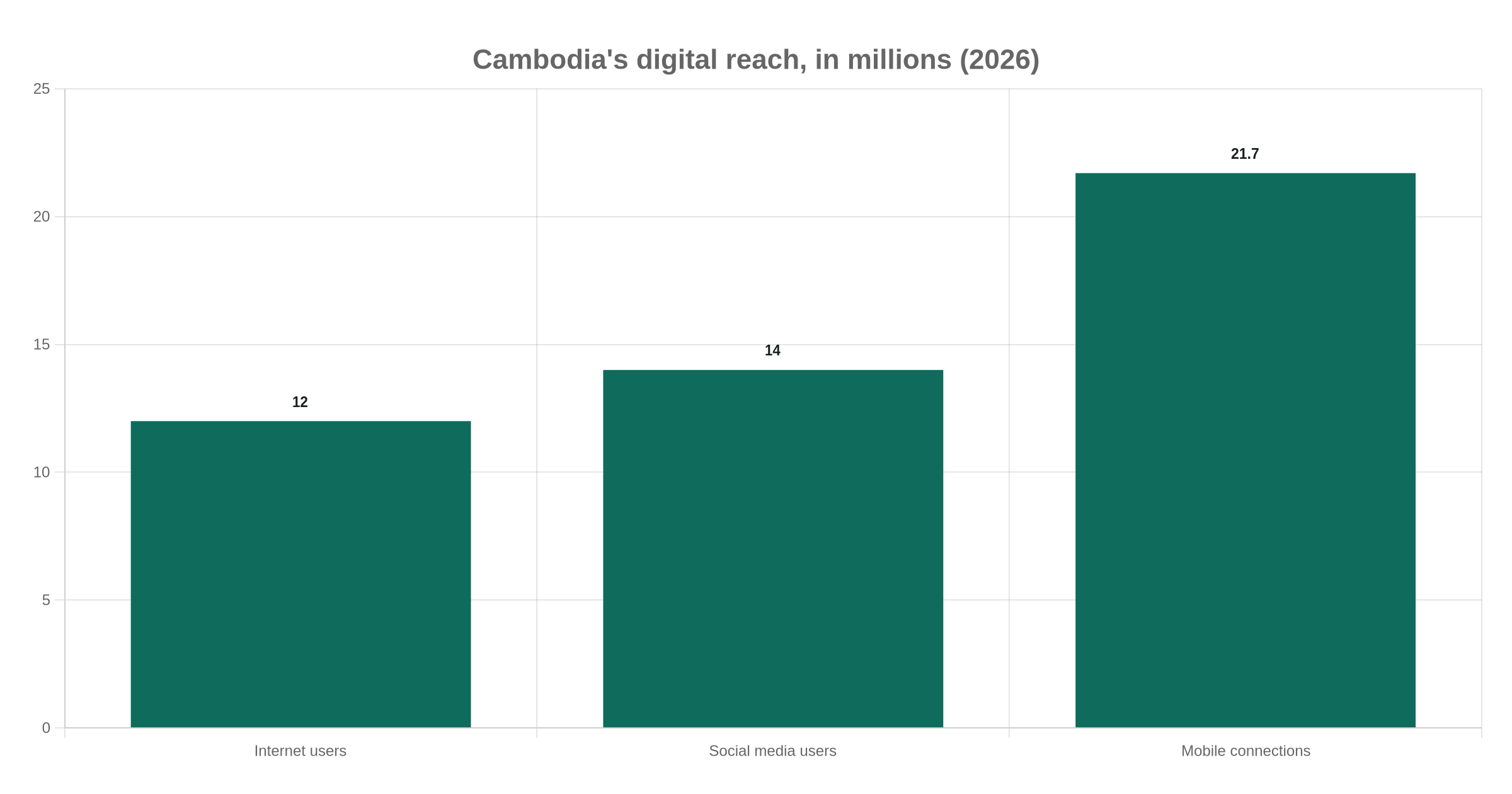
With 12.0 million internet users out of 17.9 million people, and 21.7 million mobile connections (DataReportal, Digital 2026: Cambodia), most of that traffic reaches a site on a phone, not a desktop, exactly where a broken Khmer font is most visible and least forgivable.
What is Khmer Unicode, and why does it matter for SEO?
Khmer Unicode is the character encoding standard, settled by a government standardization effort in the early 2000s, that maps every Khmer letter, subscript consonant, and vowel sign to one fixed code point in the U+1780 to U+17FF range, instead of a font-specific keystroke trick (Wikipedia, Khmer (Unicode block), 2026). A national committee working with NiDA (the National ICT Development Authority) spent roughly 10 years negotiating that standard before adoption (Phnom Penh Post, 2026). The policy weight was real: NiDA stated that a government document not typed in Khmer Unicode would not be signed by the then Deputy Prime Minister (khmerfonts.info, citing NiDA). The Ministry of Post and Telecommunications has since released Khmer Digital, an official Unicode typeface positioned as the national standard font for digital government, submitted to Google Fonts in nine weights (GitHub, google/fonts issue #10552, 2026).
This is the same standard our branding agency in Phnom Penh work starts from: a clear, Unicode compliant type system before design begins. For SEO, the distinction matters because search engines index the character stream, not the picture the font paints. A legacy-encoded page can look readable to a Khmer speaker and still contain zero real Khmer words to Google, since the underlying bytes are Khmer Unicode only when the source text actually uses it.
Which Khmer web fonts should you actually use on your website?
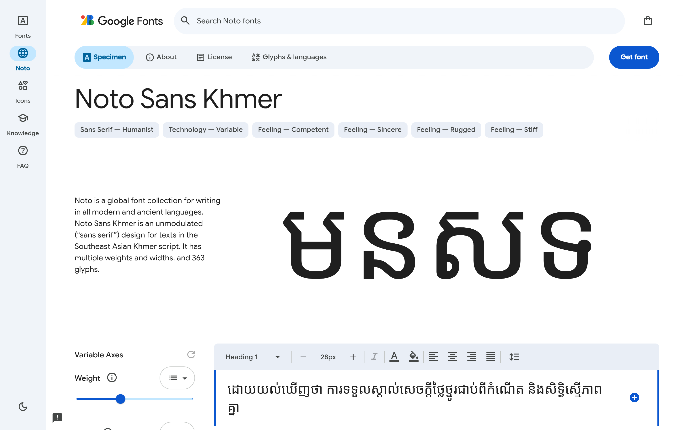
For body text on a Cambodian business website, Noto Sans Khmer should be the default, and everything else on this list is a supporting or display choice. It is free on Google Fonts, carries the widest Khmer Unicode coverage of any web-distributed font, ships in nine weights on a single variable file, and matches the Latin Noto Sans family glyph for glyph (Google Fonts, 2026).
| Font | Best for | Weights | Notes |
|---|---|---|---|
| Noto Sans Khmer | Body text, UI, forms | 9, variable | Widest Unicode coverage, free, matches Latin Noto Sans |
| Noto Serif Khmer | Long-form articles | 4 static | Pairs with a serif Latin face for an editorial register |
| Kantumruy Pro | Body text, modern brands | Variable, 5 weights | Rounder shapes, taller x-height, reads well small |
| Battambang | Headings, short UI labels | Regular, Bold | Friendly and rounded, loses clarity below 16px |
| Moul or Koulen | Display headings only | Single weight | Decorative, never for body copy |
| Khmer OS (system font) | Avoid on the web | Not applicable | Unicode compliant, but a desktop font, not licensed for @font-face |
If Khmer type is part of a bigger identity refresh, our logo design costs in Cambodia breakdown covers the budget question that follows.
How do you pair a Khmer font with your Latin or English typeface?
Pair Khmer type with a Latin typeface that shares a similar x-height and weight: Noto Sans Khmer with Noto Sans, or Kantumruy Pro with a geometric sans like Inter. Khmer script stacks subscript consonants below the baseline and places vowel signs above the letter, so a Khmer line needs more vertical room than a Latin line at the same size.
A line-height of 1.4, fine on an English-only site, will clip Khmer diacritics on the line above and below it. Most bilingual builds we scope move to 1.6 to 1.8 on any block that mixes or switches to Khmer. A common failure is a Khmer body font paired with a condensed Latin display face picked for the English headline: the two scripts end up mismatched in weight and rhythm, so the page reads as two designs glued together.
This default is not right everywhere: a boutique hotel or heritage brand trading on a colonial or Angkorian identity often reads better in Noto Serif Khmer with a serif Latin face, where a formal, editorial register outweighs the safety of a geometric sans pairing.
Do Khmer web fonts slow your site down?
Khmer web fonts can slow a site down if every weight loads as a separate static file, but a single subsetted variable font avoids most of that cost. Noto Sans Khmer alone carries 363 glyphs across the Khmer, Khmer Symbols, Basic Latin, and General Punctuation Unicode blocks (Google Fonts, 2026), far beyond a Latin-only font, because Khmer needs a separate glyph for every base consonant, subscript form and vowel combination.
As a rough guide, an unsubsetted static Noto Sans Khmer weight commonly runs 150 to 250 KB as a TTF file; a properly subsetted WOFF2 covering only the characters used typically lands under 40 KB, roughly an 80 to 90 percent cut by our own math. Web.dev backs the direction rather than that exact figure: an unsubsetted font for an Asian script is "often measured in megabytes instead of tens of kilobytes," and WOFF2's Brotli compression beats WOFF by up to 30 percent before subsetting starts (web.dev, Reduce web font size, 2026).
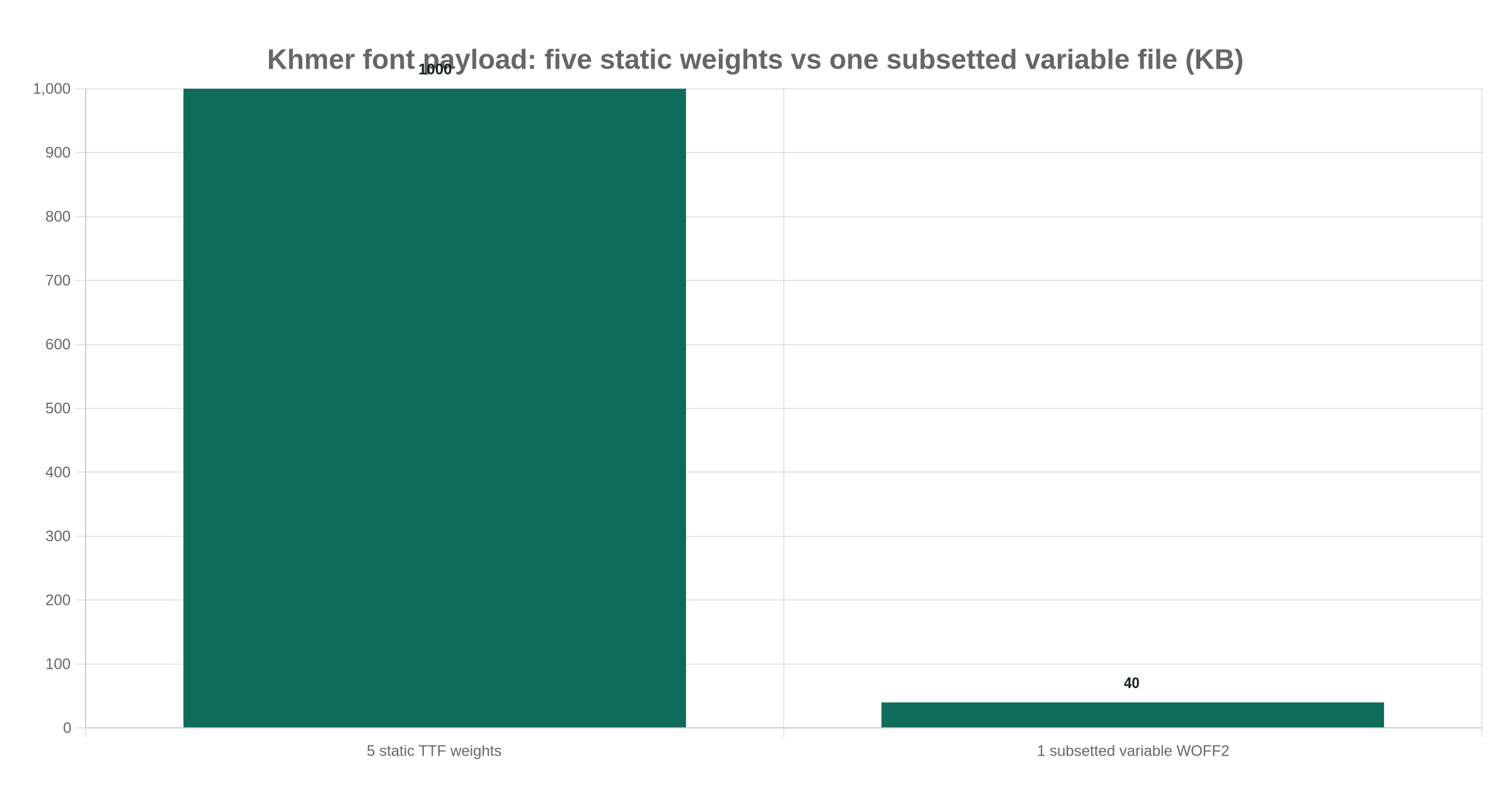
A Phnom Penh real estate developer running bilingual property listing pages shows what that means in practice: five static weights add up to roughly 1 MB of font payload before a single listing photo loads, against under 40 KB for one subsetted variable WOFF2 file. On this math alone, a single variable file beats five static weights in nearly every project we scope.
That 960 KB gap is not only a file-size number. At Cambodia's median mobile download speed of 53.58 Mbps (DataReportal, Digital 2026: Cambodia), the raw transfer time it costs is only around 140 milliseconds. The real cost sits elsewhere: five separate font files mean five separate HTTP requests before every weight arrives. In our experience building bilingual sites on Cambodian mobile networks, it is that added request latency, not the raw bandwidth, a visitor actually feels while a page's Khmer text waits to render. One subsetted variable file cuts the font stack down to a single request.
Three habits keep the cost down on every build: subset to the characters the site uses, preload the one or two critical weights with a <link rel="preload"> tag, and set font-display: swap so visitors see fallback text instead of a blank page while the font downloads.
Common mistakes with Khmer fonts on Cambodian business websites
These are the patterns that come up again and again once a bilingual Khmer and English site is already live:
- Using a display font for body paragraphs. Moul and Koulen look striking in a hero headline and become illegible the moment they carry a full paragraph on a small screen.
- Keeping a legacy, non-Unicode font because "the brand guide says so." A brand guideline written before 2010 was often built around a legacy font by default, not a deliberate Unicode decision.
- Never testing on both iOS and Android before launch. iOS falls back to Khmer Sangam MN, which Apple's own support forums document as having rendering defects (Apple Support Communities, 2026); Android falls back to a different system font. Test the real web font on both platforms, not the device defaults.
- Forgetting lang="km" on Khmer text blocks. The language attribute affects hyphenation, how screen readers pronounce the text, and how search engines segment mixed-language pages.
- Loading every weight of a variable font family as separate static files. This is the single easiest way to double a page's font payload for no visible benefit.
All five share one root cause: Khmer type treated as an afterthought, not designed alongside the Latin type system.
How TechFlow builds bilingual Khmer and English sites that render correctly
As a creative agency in Phnom Penh, we treat the Khmer font stack as a design decision, not a last-minute developer patch. Type selection happens during the UX/UI stage in Figma, alongside the Latin system, then gets checked again at testing and go-live.
We would never ship a bilingual site on a legacy, non-Unicode Khmer font: it breaks search indexing no matter how good the English side looks, and is hard to reverse without re-typing every page. If your site still carries one, talk to our brand and design team, get a quote, or browse our project work to see how the type system shows up across a finished site.
Prefer to chat? Message our founder directly on Telegram (@maxgrolier), or book a call with the team.
Frequently asked questions
Is Noto Sans Khmer free to use commercially?
Yes. Noto Sans Khmer is distributed under the SIL Open Font License 1.1, which allows free use, including commercial websites, without a licensing fee (Google Fonts, 2026).
Can I use a Khmer font from Canva or a font pack shared on a Facebook page for my website?
Usually not safely. Most fonts shared through font-pack pages or a Canva account are not licensed for web embedding, and are often exported as desktop TTF files rather than proper WOFF2 web fonts; check the license and format first.
Does Khmer text need a different line-height than English text?
Yes. Because Khmer stacks subscript consonants and vowel signs above and below the baseline, most bilingual builds need a line-height between 1.6 and 1.8 on Khmer text, compared with roughly 1.4 for Latin-only copy.
Will Google index Khmer text on my site if I use the wrong font?
It depends on the encoding, not the font. Genuine Khmer Unicode text indexes correctly regardless of which Unicode-compliant font displays it; the real risk is a legacy, non-Unicode font whose text search engines cannot read as Khmer at all.
What Khmer font shows up on iPhone and Android if my web font fails to load?
iPhone falls back to Khmer Sangam MN, iOS's built-in Khmer font, which Apple's own support forums document as having real rendering defects on some devices (Apple Support Communities, 2026). Android falls back to a different, Noto based system font. Neither matches a custom web font exactly, one more reason to preload the real font rather than rely on a fallback.
How many Khmer web fonts does a single site actually need?
Usually two at most: one primary font for body text and UI, and optionally one display font for large headlines. Loading more than that adds page weight without a visible design benefit.